What Does a Derecho Look Like?
Late Friday, June 29, 2012 a destructive set of thunderstorms swept through the Mid-Atlantic region. With winds of up to 80 mph, the storms produced extensive damage and left several million utility customers without electricity. The National Weather Service (NWS) refers to this kind of fast-moving, long-lived, large, and violent thunderstorm complex as a “derecho.”
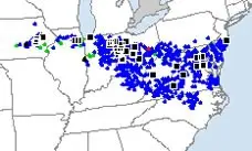
On the NWS map below, blue marks indicate reports of damaging wind. Black squares indicate winds over 75 mph.
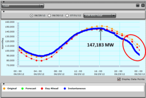
The graph below shows PJM system wide load during the day of Friday, June 29, 2012, with demand peaking at 147,183 MW at 16:20 (blue line). Late in the evening, you can see the drop off in demand resulting from the storm, with the most rapid decline starting around 22:00.
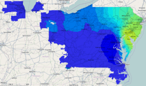
The map below shows LMPs at 23:45 on Friday, 6-29-12, shortly after the storms had passed over Washington, DC and Baltimore but had not yet reached their full intensity on the Delmarva Peninsula and in southern New Jersey. LMP prices in the legend are in dollars per megawatt-hour.

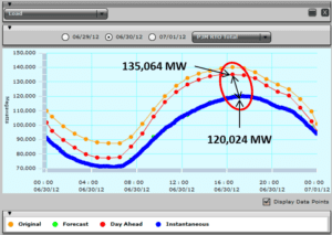
On Saturday, 6-30-12, demand in PJM reached only 120,024 MW at 17:30 (see blue line below), a reduction of more than 27,159 MW, or more than 18% lower than peak demand the day before.
The graph below shows demand within the Pepco Zone during Friday, 6-29-12. Demand in the Pepco Zone reached a peak of 6,592 MW at 16:30 and then slowly dropped to about 5,500 MW by 22:30. Then the storm hit. As the storm made its way over Pepco’s service territory, demand plummeted by 3,000 MW, or 45%, in less than one hour as much of the distribution system was damaged and service rendered inoperable.
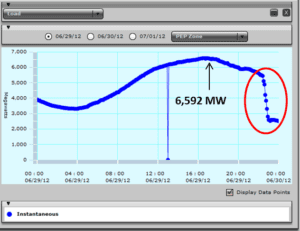
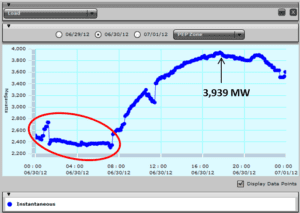
The following day, Saturday, 6-30-12, demand in the Pepco Zone continued to decline until 07:00, when it reached a low of approximately 2,300 MW. Later the same day, demand peaked at only 3,939 MW, a reduction of 2,653 MW or 40% lower than the prior day’s peak. Note the different vertical scale on the graph below.
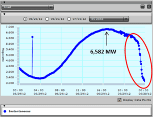
The story was similar in the Baltimore area. Demand in the BGE Zone peaked at 6,852 MW during Friday, 6-29-12. The storm hit the area around 22:30, after which demand plummeted over the course of about an hour from about 6,000 MW to about 3,400 MW.
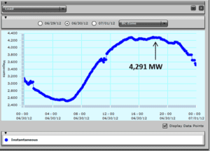
The following day, demand in the BGE Zone peaked at only 4,291 MW.
The table below summarizes peak demand before and after the storm. On Friday, 6-29-12, prior to the storm, peak demand in PJM was 147,183 MW. The following day peak demand was 120,024 MW, a more than 18% decline. However, it is important to note that there are factors other than the storm related outages that influenced the decline in peak demand, most notably the day of the week. 6-30-12 (the day after the storm) was a Saturday, and on weekends commercial load is generally lower. In fact, the “day ahead” peak demand forecast for 6-30-12 (made before the storm hit) was 135,065 MW. This is a more realistic reference from which to measure how much load in PJM was still offline 18 hours after the storm. By this reference, load was off by 15,040 MW, or a substantial 11%. The level of load reduction in the Pepco and BGE zones was much more significant.

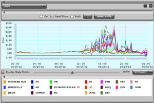
The graph below shows locational marginal prices ($/MWh) over the course of the day of Friday, 6-29-12. Prices peaked at $280/MWh during the late afternoon and remained volatile during much of the evening. When the storm hit the major East Coast load centers at about 22:30, LMPs briefly sank to $0, recovered, and then diverged significantly as midnight approached. LMPs in the Pepco Zone went negative as there was more supply than the now greatly diminished load. Negative LMPs in a congested zone, such as the Pepco Zone, is a highly unusual phenomenon and is an indicator of how rapid and extensive the damage was during the storm.
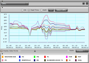
The graph below shows a close up of this significant divergence:
Before June 29, few of us were familiar with the term “derecho.” Now we know what one looks like.
Notes:
– “PJM” refers to the PJM Interconnection, which is a Regional Transmission Organization and operates the electric transmission system serving all or parts of Pennsylvania, New Jersey, Maryland, Delaware, the District of Columbia, Illinois, Indiana, Kentucky, Michigan, North Carolina, Ohio, Tennessee, Virginia, and West Virginia.
– Data and maps from PJM.
The Avalon Advantage – Visit our website at www.avalonenergy.us, call us at 888-484- 8096, or email us at jmcdonnell@avalonenergy.us.
Copyright 2012 by Avalon Energy® Services LLC